How to Create a Monochromatic Sepia Effect in Darktable
I noticed that Instagram doesn't have a sepia-tone filter, so this week, I played around with creating a sepia effect in Darktable. It’s actually quite easy. You can create a good baseline for the effect with only two modules. By adding another two, you can make an even more dramatic effect. Below, I walk you through the process. At the end of the post, I also share a downloadable style that I created to help you get a head start.
Modules needed
First, you’ll need to adjust at least two modules: Color Calibration and Color Balance RGB. The Color Calibration module is used to turn the image to grayscale. Then, the Color Balance RGB module adds the color shift to sepia.
Process
To turn your image into black and white, you can adjust any slider on the “gray” tab of the module. You can control the relative contributions of the red, green, and blue pixels to the resulting monochrome image, or you can select one of the monochrome film emulation presets for a quick setup.
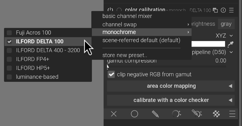
Select a monochrome preset by clicking the hamburger menu or by right clicking the title bar.
Your image should now be in black and white. Next, we add the sepia color cast with the Color Balance RGB module. To do this, find the module and click the “4 ways” tab. Then, set the “hue” slider in the global offset to 30°, as noted on Wikipedia. You can set it directly by right-clicking the slider and typing 30. Next, set the “chroma” slider all the way to the right. Lastly, you may want to increase the overall brightness by bumping up the “luminance” slider.
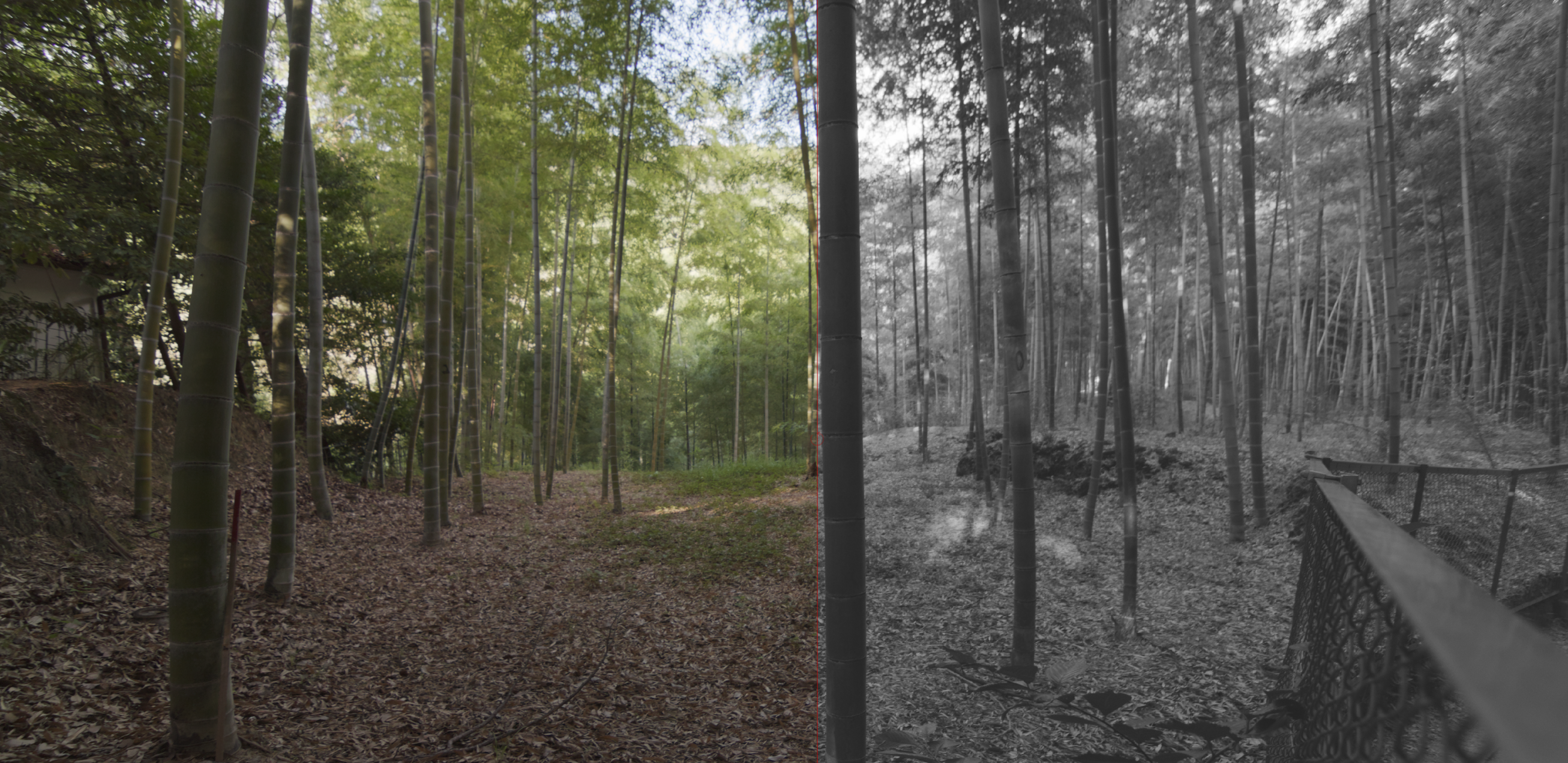
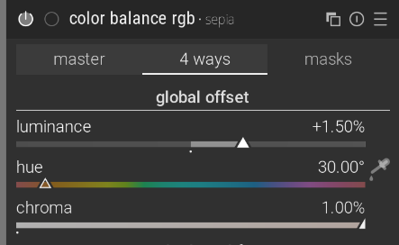
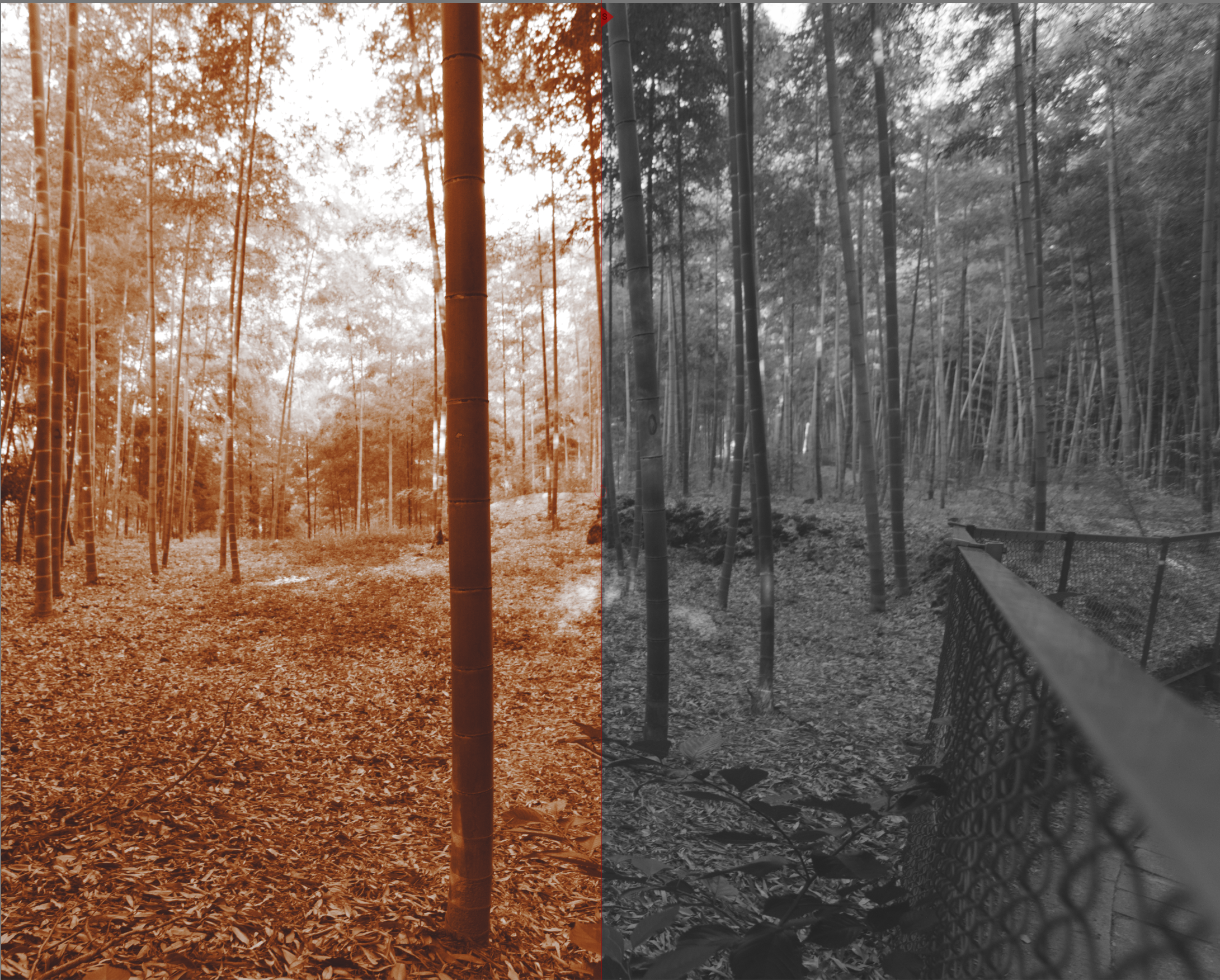
After applying the Color Balance RGB module, your image should now be in grayscale. Then, use the Color Balance RGB’s “4 ways” global offset at 30° to add the sepia color cast.
That’s the gist of it. There are other adjustments you can make to increase the effect or make it look older or make it pop. Still in the Color Balance RGB module, I usually increase the contrast and adjust the saturation of the shadows, midtones, and highlights. Depending on the image, I might decrease the brilliance in the shadows and increase the highlights (for additional contrast). With monochrome images, contrast becomes more important to make up for the lack of color.
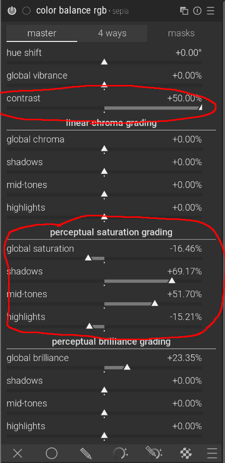
These settings are a good addition to increase contrast in the image.
Making it moodier
By stacking on two more modules, we can add some finishing touches to the effect to make it look more like an old photograph. I do two things: first, I turn on the Vignetting module, then I apply the “bloom” preset of the Diffuse or Sharpen module with a mask applied around the edges of the image. This blurs the edges and makes them glow, giving it the effect of an old camera.
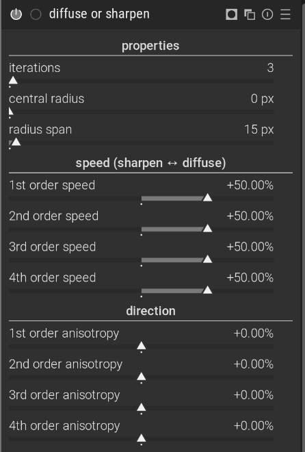
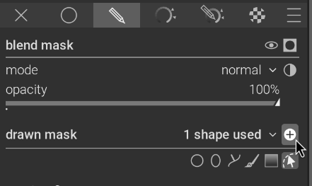
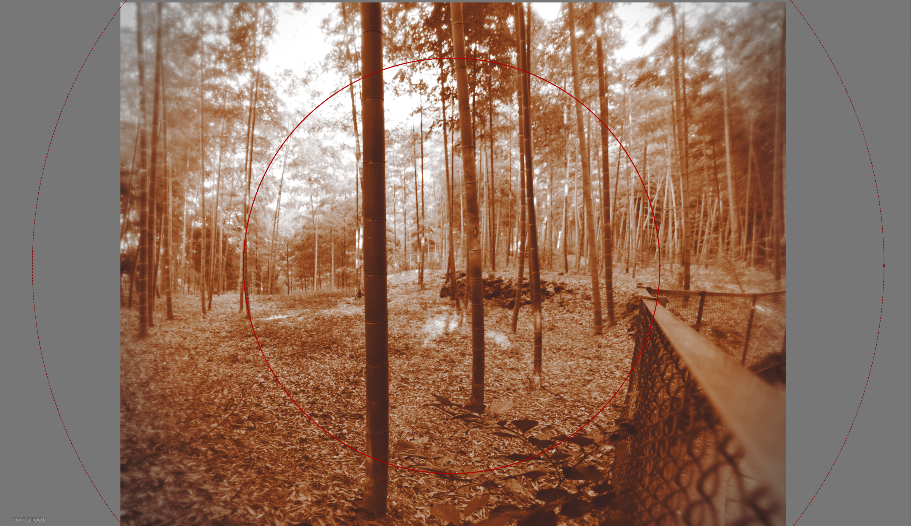
Apply the bloom preset, but reduce the iterations and radius span to tame the effect. Then, apply a circular drawn mask with a wide feathering. Make sure you invert the mask to apply it to the edges only.
Vintage fade
This is a nice effect that you couldn’t achieve with Instagram’s filters. You can go even further by adding other modules. For example, you could give it a faded look (low instead of high contrast) by increasing the target black level in Exposure, Sigmoid, or Filmic RGB module. A handy way to do that with exposure is to drag the left portion of the histogram to the right.
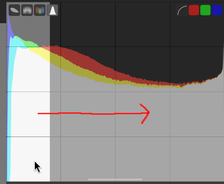
Drag the black level region to the right to raise the black point, effectively brightening the shadows of the image and reducing contrast for a faded look.
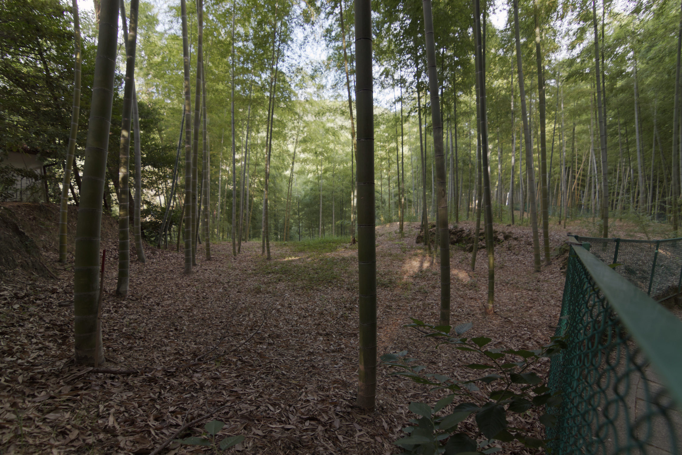
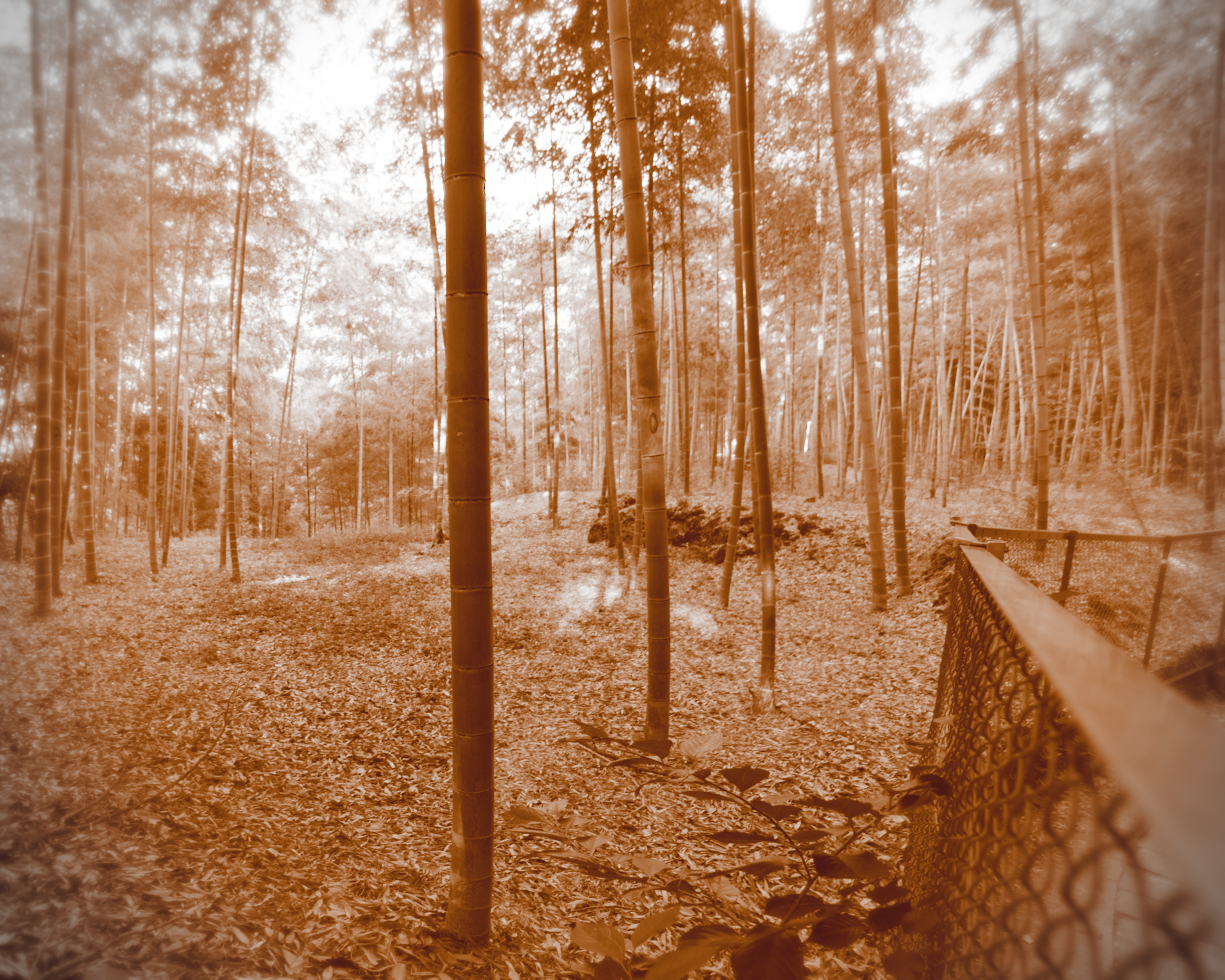
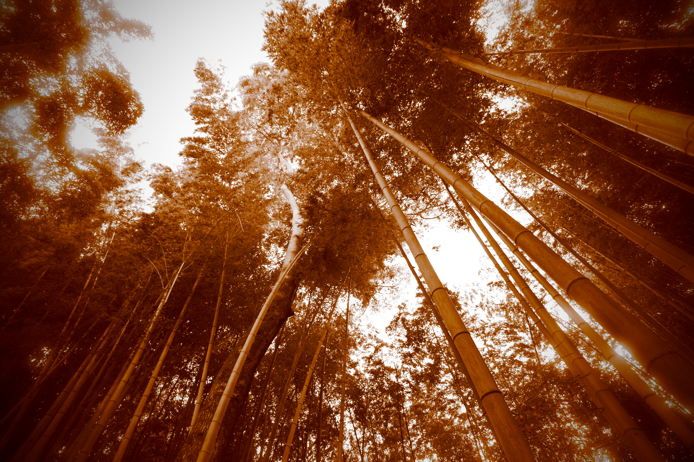
With all of these effects applied, you should now have a dramatic monochrome sepia effect. To make this easier to apply, I’ve saved the settings as a style and made it available for download below. Here's the before-and-after:
Downloadable Darktable style
Download the style file as a convenient starting point for your own sepia images.
sepia.dtstyle • 2 KB