How to Calibrate White Balance and Adjust Colors in Darktable
When you take a photograph, different light sources will give different tints to the resulting image. When you take a picture in daylight, for example, a white piece of paper might look slightly orange, while the same paper under an LED light will look blue. This balance between the warm oranges and cooler blues is called white balance. And do you remember that black and blue dress that lit fires around the internet? That had a lot to do with how the brain adapts to different light sources. While our brain does that automatically for us—sometimes unreliably—we have to do it manually for images from our cameras.
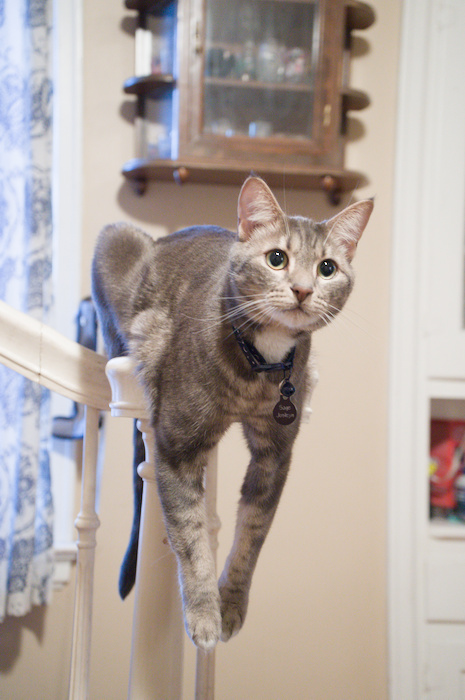
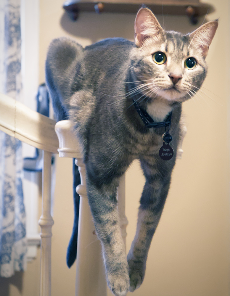
To illustrate how to set the white balance of an image, I’ve chosen a recent picture taken at my parents’ home:
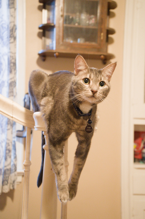
Straight out of the camera, this image has a strong orange tint
This is my parents’ cat. Her name is Sage. In this image, she’s perched on the banister in the dining room, where the incandescent light gives her an orange tint. To correct the white balance, we’ll have to cool that tint off to get a more neutral color to work with.
Why should we adjust white balance in this photo? Part of it has to do with personal taste. But, if you want to do creative things with the colors, that orange cast will turn everything into the color of Cheetos. So, we’ll first adjust the white balance to make sure the cat’s white fur actually looks white.
Tools to use
To set the white balance, I’ll use Darktable’s color calibration module, which is the default module for adjusting white balance in recent versions of Darktable. I’m using Darktable 5.2.1, the latest release as of this writing.
After setting the white balance, I have some options for further adjusting the colors. To correct some colors that stand out too much, we can use the color equalizer (color EQ). I’ll also use it later as a creative tool to enhance some colors. Lastly, I’ll show how to do some color grading using the color balance RGB module.
Calibrating the white balance
When calibrating the white balance for an image, I like to switch to the RGB parade visualization. This shows the relative balance of each of the primary colors across the image. Equal parts of red, green, and blue make black, gray, and white. The horizontal axis represents the X axis of the image, while the vertical axis represents the lightness of each color. In the image of Sage the cat, blues are underrepresented, while reds are more prominent. You can tell because the blue part of the parade is lower on the graph than the other colors. This also makes sense, because we know from looking at the image that it’s got a strong warm red tint.
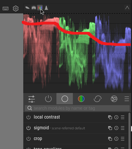
The red line shows how the red, blue, and green colors are out of balance
To start adjusting the white balance, open the color calibration module. You can find it on the colors tab or by searching for it by name. If you click on the eyedropper next to the color swatch, the module will automatically set the white balance, and often it works really well.
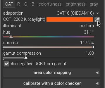
The automatic setting worked very well in this case. Now, the cat’s white fur actually looks white. It is skewed just a little bit to the warm side because of the blue light coming from the window on the left, but overall, it’s pretty close. To reduce the red slightly, you can either adjust the eyedropper’s selection to exclude more of the blue parts of the image by clicking and dragging a selection on the image, or you can manually adjust the red and blue on their respective R, G, and B tabs in the module. I’m satisfied with the automatic correction, so I’ll move on.
Taming colors that stand out too much
No matter how you set the white balance, some colors will still stand out more than others. Now that the white balance makes the image look natural, I find the blue stands out a little too much. I actually discovered this when I started to increase the contrast and saturation of the image in the color balance RGB module. The blue became far too noticeable. A better, more reliable way to discover this is to use the vectorscope visualization.
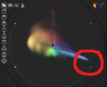
More intense colors live closer to the edge of the vectorscope; we can use this to identify colors that need to be adjusted
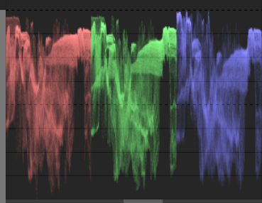
This tool shows the saturation and concentration of different colors in the image. Saturated colors are closer to the edge of the image, while more frequent colors show up in a lighter hue on the graph. Switch to the RYB color space with the button on the top right, and switch between logarithmic and linear scales to identify which colors stand out more than others. The vectorscope for our white balance-adjusted image shows that the blues are more saturated than the rest of the colors in the image. Before making creative adjustments, I’ll reduce the blue saturation slightly so it doesn’t overpower other colors when I adjust the saturation later.
Now that I’ve identified a color that needs adjustment, I’ll use the color EQ module. Targeting a specific color with this module is a three-step process. First, use the eyedropper tool to select a color from the image that you want to target. It will show a line on the graph where that color resides. Then, you can adjust the node placement left or right so that one of the nodes falls on that line. Lastly, you can adjust the hue, saturation, and brightness of that particular color. In the screenshot below, you can see the process, and the resulting vectorscope. Note how the distance from the edge of the yellows and blues are now almost the same.
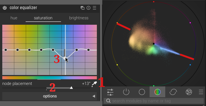
Note how blue and yellow are nearly the same distance from the edge of the vectorscope after adjustment
Additional creative adjustments
Now that we have a neutral base to work with, there are two things I’d like to adjust in terms of color. First, the cat’s eyes are a light green, but in this lighting they don’t stand out against the color of the background and her fur. So, I’ll use the color EQ module to increase the saturation of her eyes.
To do that, I’ll apply two circular masks, one on each of her eyes, set with a small feathering border which gradually blends the edge for a more natural look. Masks allow you to apply adjustments to specific parts of the image. Then, using the eyedropper tool (a common and useful feature, as you may have noticed), I’ll select the color of her eyes and rotate the node placement so the nearest node falls on that color. From there, I can adjust the hue and saturation to be a little more yellow.
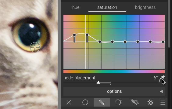
Pick a color with the eyedropper, then adjust the hue, saturation, and brightness to your liking
Next, I want to draw attention to Sage’s face, so I’ll draw a mask around the cat’s face and invert it so I can use it to darken the rest of the picture using the color balance tool. There are also other tools that allow you to adjust the brightness of an image, such as the tone equalizer module, but the color balance RGB module handles these adjustments perfectly.
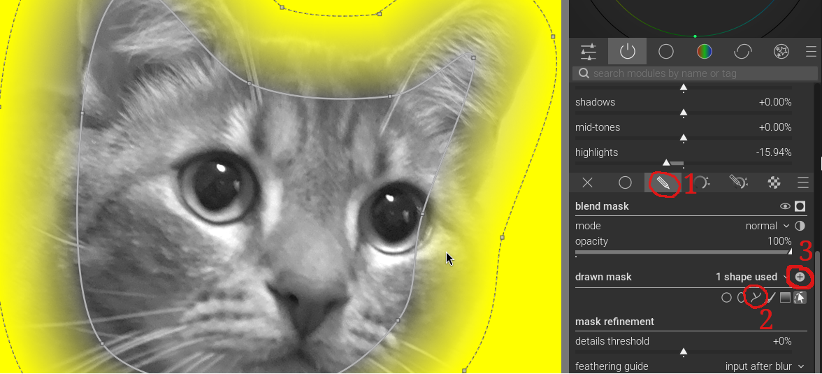
I've inverted the mask to select everything outside the mask for darkening, rather than lightening her face
Lastly, I’ll create another instance of color balance RGB to make global adjustments. I’ll increase the global vibrance and chroma, with a boost for shadows to increase their colorfulness. Vibrance adjusts the colorfulness for low-chroma colors. Chroma is how colorful a color is at a constant lightness. It differs from saturation in that higher saturation means colors also get darker.
Then, in the 4 ways tab of the module, I can add creative color casts to different parts of the image. It has sections for global offset, shadows, midtones, and highlights. Each section has three sliders, where luminance adjusts brightness, hue selects the color of the color cast, and the chroma decides how colorful that color cast will be.
This is where you can achieve split-toning effects, for example the classic teal and orange from blockbuster action movies, or whatever you like. If you want warmer shadows, you can warm them up by choosing an orange hue, or whatever your creativity suggests.
This is why it’s important to get the white balance right and to make color corrections on your image before playing with color. Without making those baseline adjustments, you’re limited in what you can do with colors in the image.
The finished image
Here’s the finished product. Using only three tools—color calibration, color EQ, and color balance RGB—I went from an image with a significant orange cast to a well-balanced image with creative coloring effects. Of course, other modules, such as sigmoid, sharpen, and vignetting, helped achieve the finished produt, but these three handled all the color work. In particular, the sigmoid module is an important tool that I’ll describe in another article.
White balance and color correction aren’t the most exciting part of the image editing process, but they are critical to laying the foundation for the fun creative work that follows. Now try this on your photos. Watch how white balance adjustments are reflected in the RGB parade, and play with different settings to get a feel for what they do and how they can help you achieve the desired effect. I’ve learned a lot just writing this article, and I’ll be applying these techniques to a recent batch of fall foliage photos to really make them pop.