Bias-Variance Trade-Off: The Case of a Lemonade Stand

Me at my lemonade stand
Welcome to my lemonade stand, Randy’s Rockin’ Refreshments. It’s a sole proprietorship. Over the past several years, I’ve allocated some of my budget to advertising in order to increase sales. It works, generally speaking. But, I’d like to know what sales I can expect for a given budget. Since we’re talking about big money here (tens of dollars), it makes sense to use machine learning to answer that question. I might even be able to afford more lemons!
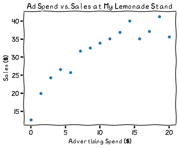
The relationship looks linear, mostly
Since the relationship looks more or less linear, it might make sense to use a simple linear regression as my prediction. That would look like this:
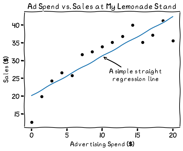
This linear regression line may not fit the data perfectly. While the line fits most points, spending at zero and 20 suggest a different shape to the data
It fits fairly well, but the line doesn't capture the drop-off at lower spending nor the leveling off at higher spending levels. Should I make the prediction more complex to better capture the shape of the data?
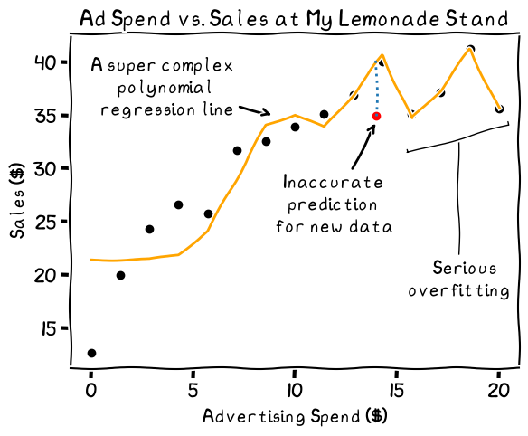
An example of overfitting, or extreme variance. Note how far the new data point is from the line, indicating a bad prediction
This line’s a lot more complex. It follows nearly every point in my data, but this is probably not a good thing. My sales data is not perfect. There’s always an element of chance in how many customers I’ll have on a given day, regardless of how much I spend on advertising. When I get new data, therefore, my predictions with the complex model may be wildly off.
The decision of how complex to make a model leads to the bias-variance trade-off. Drawing a straight line, in our case, would fit a lot of the data, but it would miss the trends at the lower and higher ad spending values. This is called bias. The regression line, in other words, isn’t very flexible. When we have high bias in a prediction model, we call it “underfitting” the data.
On the other hand, we have the squiggle shown in the graph above, which fits almost every data point (“overfitting”). This is the extreme end of variance—how flexible or squiggly your regression line is. While it looks accurate for your known values, it will tend to perform poorly when you give the prediction model data that it hasn’t seen before.
In summary, bias is like the stiffness of the line, while variance is the squiggliness. For high bias, you’ll miss some trends and data points. For high variance, you’ll predict your known data well, but perform poorly on new data. The key is to find a balance between the two.
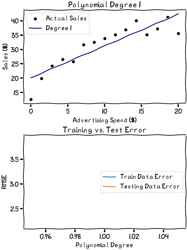
So, how do we find that balance? In the simple case of my lemonade stand, I can decide what degree polynomial regression line best fits the data. To assess them, first, we split our data into a training set and a testing set. For each degree, we check how far off its predictions are for the training and testing set. Last, we compare the two.
As the degree increases, the overfitting gets worse. It’s best to stick to the lower degrees in this case
The animation shows the explosion of the error as variance increases and the line begins to overfit the data. It’s best to choose a degree well below where the error starts to explode. Especially considering the relative simplicity of our data, anything above the third degree is probably unwise. The second or third degree would likely be the sweet spot in the bias-variance trade-off for my data.
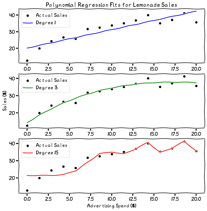
The third degree looks like a safe, balanced choice
So, there we have it. I have a machine learning model that I can use to predict my sales based on my advertising spend. Great. I also learned that when in doubt, start simple and iterate from there. (That helped a lot while I was preparing the visuals for this post.) The business forecast is looking up!
The graphs in this post were created with Matplotlib, with tactical use of the .xkcd() method. Disclaimer: I don’t really own a lemonade stand, and the data was all made up. The cartoon image of the lemonade stand was created with DALL·E via ChatGPT. I’d like to draw it myself, but time, skill, and motivation limit me.